Communication and data go hand in hand.
Great communication should be informed by great data, and great data should be explained through great communication. But to really make the most of your data and deliver informed, targeted engagement and communication strategies, you need to know how to humanise data.
From data collection and analysis that puts people at the centre, to the delivery of data-driven communications that inspire, here’s how to keep your data human.
Don’t just collect data – collect stories.
Data is about more than just the numbers – it’s about the people behind the numbers.
Say you’re planning a new infrastructure project that might be controversial. You want to know how the community feels about it so you can engage with them effectively. You’ve run a survey to understand whether people object to or support the project, and why. Based on the results:
- 40% of the community support your project
- 60% don’t.
Their main reasons for opposing the project are:
- impacts to the local environment
- road congestion
- disruptions / changes in the local area.
How do you engage with that 60% to gain more support for your project? How do you humanise your data?
Begin by understanding your audience
Most surveys will cover the basic demographic questions:
- age
- gender
- location.
It’s your first point for understanding your audience. But to really understand a community you’ll need to go deeper. Lifestyle demographics, like household and tenure types, can give you more insight into the everyday lives of the community. For example:
- a family household with children concerned with congestion might really be thinking about safety
- home owners might worry that disruptions / changes could impact their property value and their lifestyle.
You can get the most value from your data by:
- asking the right demographic questions
- looking at new ways to gather information.
You can build on your existing data set with other research or human data.
1. Find the common connections between views and demographics
- Are people of a certain age more likely to support or oppose your project?
- Do they have shared reasons for this stance?
- Do those shared reasons become more specific when you also consider their household type, and where they live?
- Can their demographics provide you more insight into what their values are, and how these influence their stance on the project?
Criss-tabulation analysis of survey results against demographic data can help you go deeper. This kind of analysis can help find the connections between the people and the numbers.
This allows you to begin building a story of who these people are and how you can engage with them.
2. Make sense of the numbers.
Humanising your data is about more than just way it’s collected and analysed – it’s how you present it.
You may have great information, but it will go to waste if it can’t be understood and properly used.
Gone are the days of long, dense reports and complex spreadsheets. Make your data accessible, easy to understand, and easy to put into action – especially for those who aren’t data experts.
3. Use infographics for a simple way to visualise and humanise data
There are many free, easy-to-use and even common programs to create infographics in many styles. Even PowerPoint can do a great job with infographics. And, thanks to new digital tools, these can even be interactive and woven into great storytelling.
4. Use data visualisation programs to tell a story
With data visualisation programs such as Google Analytics and Power BI, you can:
- Combine written communication and data to assign meaning to the numbers.
- Cut through the unnecessary details and focus on the information gems.
- Use a variety of different graphs to help people understand the key findings of a data set.
- Show the relationship between different data (a person’s age + popular nights of the week to go out) to connect the people with the numbers.
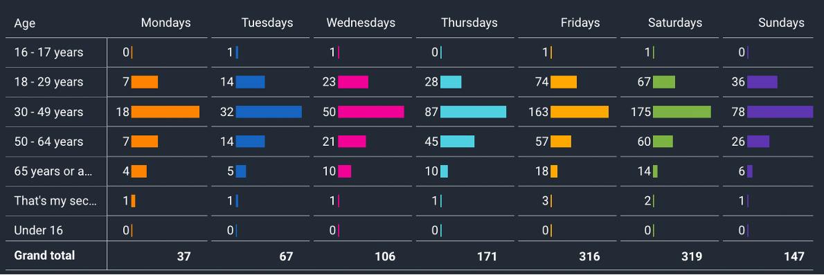
The data dashboard from one of our recent projects
5. Use community profiling to find the key groups in a community.
Audience profiles have long been used by marketers and advertisers to better understand their customers.
By analysing demographics against community views and opinions, you can create community profiles. Therefore, your communications and engagement strategy can target specific groups and achieve better outcomes.
Deliver humanised data-driven communications.
In the past we relied on instinct and experience to deliver impactful communication and engagement strategies. Now, those instincts can be combined with, and backed up by, data.
When you look for the common connections between your demographic data and the views of the community, patterns start to emerge. These patterns can form the basis of the community profile for your project.

1. Key demographics for the group
- What are they?
- What distinguishes them from other groups in the community?
2. Motivators / values
- What is important to them?
- What would motivate them to support or get involved in a project?
3. Preferred tools and channels
- What channels do they use to engage and find information?
- What communications tools appeal to them?
4. Barriers
- What are the barriers to engaging with this group?
- What accessibility issues do you need to address?
- What views or beliefs could hold them back from engaging?
Capturing people’s attention is more difficult than ever before. Therefore a catch-all approach to communications and engagement no longer cuts it. Community profiles can be a great tool to humanise data:
- deliver informed, tailored communications
- that reflect the diverse backgrounds and views of our communities,
- cut through the noise by focusing on what matters most to people.
The wrap up
Putting people at the centre of data can help improve how you collect and analyse information, how you present it, and how you can use it to deliver work that matters.
Need help humanising your data? Contact us, we’d love to help.